
In the fast-paced world of logistics and manufacturing, every metric tells a story. But the most critical story is how production and shipping performance impact the bottom line. This is the exact challenge I set out to solve: to build a shipping results tracker that provides a clear, data-driven view of our logistics efficiency. The goal was to move beyond gut feelings and use a robust data analysis approach to identify where we were falling short and what was holding us back.
Business Context: Tackling Key Shipping and Logistics Challenges
The business had a set of crucial questions that needed answering. We had to understand our operational reality and compare it against our strategic goals. Our primary challenges revolved around three key areas: managing production commitments, understanding the financial impact of delays, and pinpointing the root causes of performance gaps. This project was designed to tackle these head-on by transforming raw data into a powerful logistics KPI tracking dashboard.
Defining Success: Identifying Gaps Between Projections and Reality
The first major problem was the need to track our production against our weekly goals. We needed to know if we had enough finished product available to ship and if our production plan for the week would be sufficient to meet the target set by upper management. My solution was to run a comprehensive SQL query to get a total count of finished goods ready to go. I then combined this with the weekly production plan from an Excel file, creating a single dataset to compare against our weekly commitments. This helped us see, in real-time, whether our targets were actually achievable or if we needed to adjust our strategy. This approach created a living, dynamic shipping performance dashboard that enabled proactive decision-making.
The Challenge of Held Shipments and Their Financial Impact
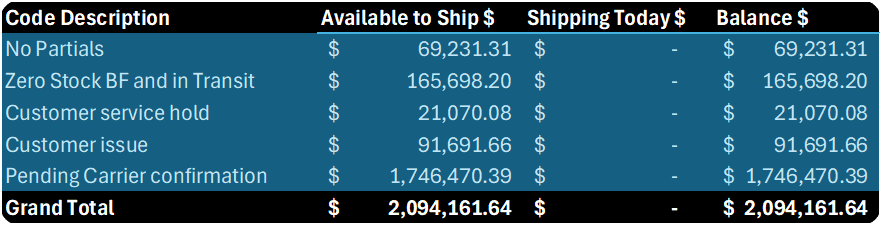
The second significant issue was the problem of held shipments. Products were being held for various reasons, and we lacked a clear understanding of the root causes and, more importantly, the financial cost. To solve this, I compared our production commitments against our actual output. I identified the customers and specific production lines that weren’t meeting their goals. The most crucial part of this was coding the root causes of the holds and assigning a monetary value to the held products. This analysis provided the C-suite with a clear view of the financial consequences of operational inefficiencies, turning a simple inventory problem into a significant business metric.
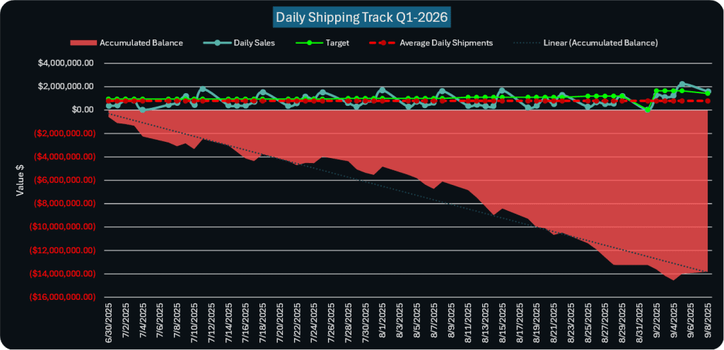
Uncovering Daily Shipping Patterns and Backlogs
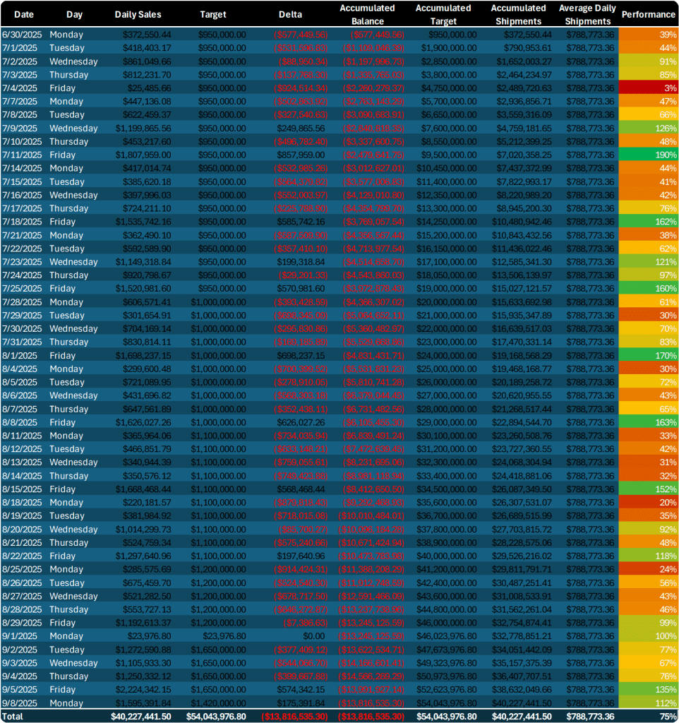
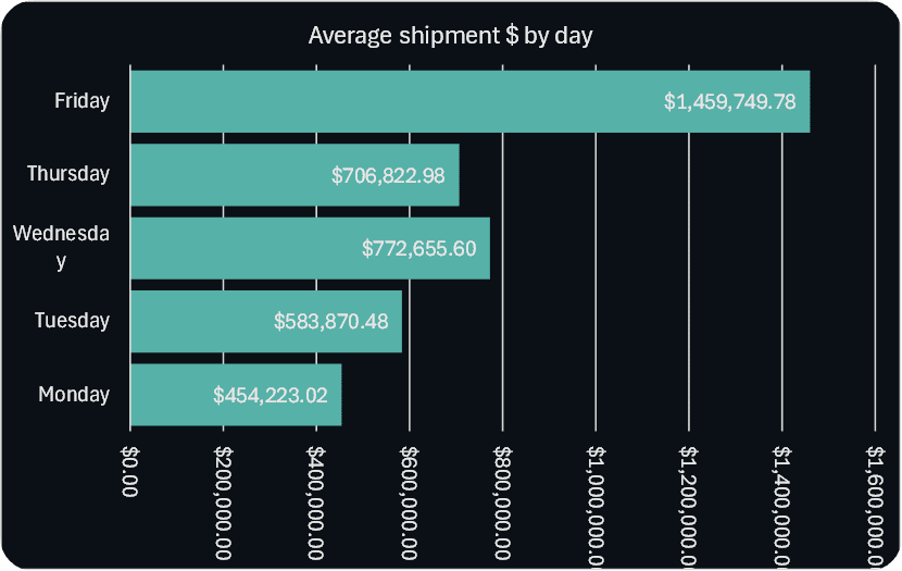
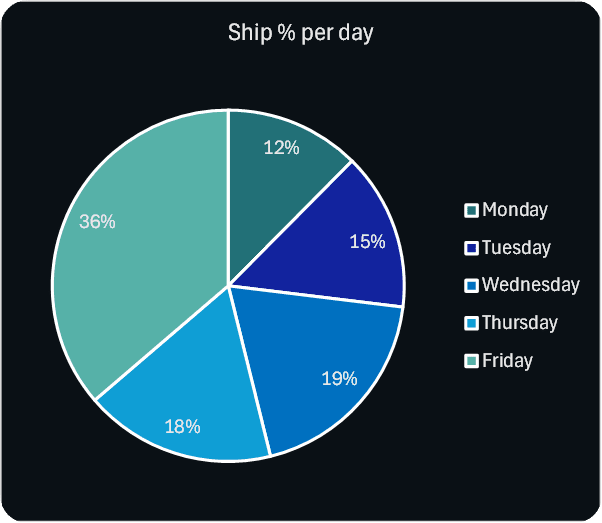
Finally, we needed to get a handle on our daily shipping rhythm. We wanted to track our daily shipments against our goals and understand if we were ahead or falling behind. I also wanted to identify the high- and low-shipping days, a seemingly simple question with profound implications for operational planning. The solution was to accumulate daily data, compare it against the target, and create a running total of the difference. This supply chain analytics approach allowed us to identify if we had a backlog to recover or if we were shipping ahead of schedule. By analyzing historical daily shipment data, I was able to calculate the daily average and identify patterns that could help us better forecast and manage resources, improving our overall logistics efficiency.
Data Sources: Integrating Disparate Information for a Unified View
A key challenge in any data analysis project is a messy data landscape. In this case, my data sources were spread across multiple systems and files, including the QAD ERP system, various Excel production plan files, and manual commitments. In my experience, integrating these sources is like assembling a jigsaw puzzle—you need patience to ensure every piece fits. This process required careful data cleaning and validation to ensure consistency and accuracy across all platforms.
Leveraging QAD, Excel, and other ERP data for a holistic picture
The backbone of the project was the QAD ERP SQL database, which provided real-time transactional data on finished goods. I used SQL queries to extract this information, but this was only one piece of the puzzle. The production plan, commitments, and target data from upper management were all captured in various Excel files. Integrating these sources required a methodical approach, using Power Query to transform and combine the data. This created a single, unified dataset that served as the “single source of truth” for the entire shipment monitoring system. It was a reminder that in the real world of data analysis, we often have to work with a mix of structured and unstructured data, and the real value lies in our ability to connect the dots.
Exploratory Data Analysis (EDA): Uncovering Patterns in Shipping Data
Once the data was prepped and integrated, the next step was to visualize it. I built a series of interactive dashboards in Power BI to make the data accessible and actionable for all stakeholders. I’ve learned that stakeholders love interactive visuals—nothing communicates a revenue impact faster than a dashboard they can explore themselves. This visualization phase was where we truly started to uncover the hidden patterns in our
Visualizing Daily vs. Target Shipments
I created a running total chart in Power BI to show the daily progress of our shipments against our goals. This chart was a powerful visual tool for daily stand-up meetings. It immediately showed if we were ahead of schedule or building a backlog. The dashboard also included slicers for different production lines and customers, allowing us to drill down and see which areas were performing well and which ones needed a boost. This ability to get a granular view was key to identifying specific issues rather than just general performance trends.
Analyzing Historical Data to Predict Shipping Behavior
The historical data from the Excel files allowed me to identify patterns in our delivery performance dashboard. By analyzing past performance, I was able to pinpoint recurring trends, such as certain days of the week consistently having lower or higher shipping volumes. This analysis provided valuable insights for operational planning, allowing us to anticipate peak and trough periods and allocate resources more effectively. We could now plan for a higher volume of shipments on historically strong days and understand why we might see a dip on others.
Analysis and Modeling: From Data to Actionable Insights
With the data visualized, I moved to the analysis phase, where I could link performance gaps to their financial and operational impacts. This is where the project truly delivered on its promise of turning data into decisions.
Dollarizing Held Shipments: Understanding the Financial Impact of Delays
The most impactful part of the project was quantifying the financial risk of held shipments. By comparing committed production against actual output and tracking the reasons for the hold-up, I was able to calculate the lost revenue associated with each delay. I created a treemap in Power BI that visually represented the dollar value of held product by reason and customer. This provided a stark, compelling visual for corporate leadership, who appreciated the clarity of a
customer-level revenue impact dashboard. Sharing these insights sparked productive discussions about how to address these root causes and recover lost revenue.
Tracking Performance Against Weekly Targets: Are We On Track?
The analysis provided real-time answers to the question, “Are we on track to meet our weekly goal?” By combining available finished goods with projected production, we could predict whether we would meet the week’s target or fall short. This was a massive shift from reactive reporting to proactive forecasting. It enabled stakeholders to see where interventions were most needed, turning raw data into a story they could act on.
Conclusions and Recommendations: Driving Continuous Improvement in Logistics
This project demonstrated the immense power of data analysis in logistics. The insights gained provided a clear roadmap for continuous improvement, leading to more efficient operations, better resource allocation, and a deeper understanding of our challenges. I’ve found that giving stakeholders hands-on access to data builds trust and drives action. The final dashboard became a tool for ongoing monitoring, helping teams track progress and implement solutions.
Key Findings and Their Impact on Operations
The analysis revealed three critical insights:
- We now had a clear, real-time picture of whether we would meet our weekly shipping goals, eliminating guesswork.
- We could see exactly which shipments were being held, why, and how much money was at risk.
- We understood our daily shipping patterns, which allowed for better resource planning and management of backlogs.
Actionable Steps for Optimizing Shipping Performance
Based on the analysis, I recommended:
- Implementing a standardized process for reporting reasons for held shipments to ensure data accuracy.
- Creating a regular review of the financial impact of held products to prioritize improvements.
- Leveraging historical data to create more realistic and achievable weekly targets.
Technologies and Tools: Powering the Analysis
This project was a great example of a practical data analysis workflow using a mix of powerful tools.
Why SQL, Power BI, and Excel were the Right Tools for the Job
- SQL was the workhorse for data extraction and processing. I wrote complex queries to pull data from the QAD ERP system, joining tables and filtering data to get exactly what I needed. Its flexibility was crucial for handling the large datasets efficiently.
- Excel was a vital supporting tool, particularly for handling the manually entered production plans and commitment data. I used it for quick data validation and cleaning before integrating the information. I also leveraged Power Query to streamline the data transformation process.
- Power BI brought the data to life. It was the central hub for our shipping metrics analysis and data visualization. I built interactive dashboards with slicers, allowing stakeholders to easily filter and explore the data, from overall performance to specific customer or production line impacts. Sharing it via OneDrive ensured accessibility for remote teams, which I’ve found simplifies version control and keeps everyone aligned.