
As a data analyst, I thrive on turning complex data into actionable insights. In this project, I tackled a critical challenge in the manufacturing industry: analyzing production performance across three levels—Site, Plant, and Customer—to understand why goals and commitments weren’t being met and their impact on revenue. My mission was to create a Revenue Impact Dashboard using Power BI, integrating data from SQL, ERP, and Excel to identify root causes and propose solutions. Here’s how I approached this multi-level manufacturing analysis, leveraging OneDrive for collaboration and delivering insights that resonated with stakeholders.
Business Context: Understanding Production Gaps in Manufacturing
Why Measuring Production Across Multiple Levels Matters
In manufacturing, hitting production targets is crucial for financial success, but the story gets more complex when you analyze performance at different levels. At the site level, I measured overall production against corporate goals. At the plant level, I drilled down into individual facility performance to spot operational inefficiencies. At the customer level, I assessed how production shortfalls affected specific client commitments. In my case, I’ve seen how misaligned expectations across these levels can create friction, so I knew a Power BI Dashboard that unified these perspectives would be a game-changer for decision-making.
The Challenge of Identifying Root Causes
The real hurdle was pinpointing root causes across these three levels. Were site-wide issues driven by specific plants? Were customer commitments unmet due to production bottlenecks or unrealistic promises? My goal was to not only quantify gaps but also provide a foundation for actionable plans, ensuring insights were relevant for site managers, plant supervisors, and corporate leadership.
Data Sources: Integrating SQL, ERP, and Excel for Robust Insights
Navigating Multiple Data Sources Across Levels
The data came from SQL databases, ERP systems, and Excel files, each providing a piece of the puzzle. SQL databases offered real-time production metrics, ERP systems provided detailed logs for site and plant performance, and Excel files captured customer-specific data, often manually entered by account managers. In my experience, integrating these sources is like assembling a jigsaw puzzle—you need patience to ensure every piece fits. I used SQL to extract and transform data, creating a unified dataset that segmented performance by site, plant, and customer.
Ensuring Data Quality and Consistency
Data quality was critical, especially with multiple levels of analysis. I cleaned and validated data to ensure consistency across sources, using Excel for quick checks and manual adjustments. OneDrive streamlined collaboration by allowing me to share datasets with plant and account teams for validation. This approach ensured a comprehensive view of production metrics, from site-wide outputs to customer-specific delivery shortfalls.
Exploratory Data Analysis: Uncovering Patterns in Production Data
Visualizing Gaps with Power BI
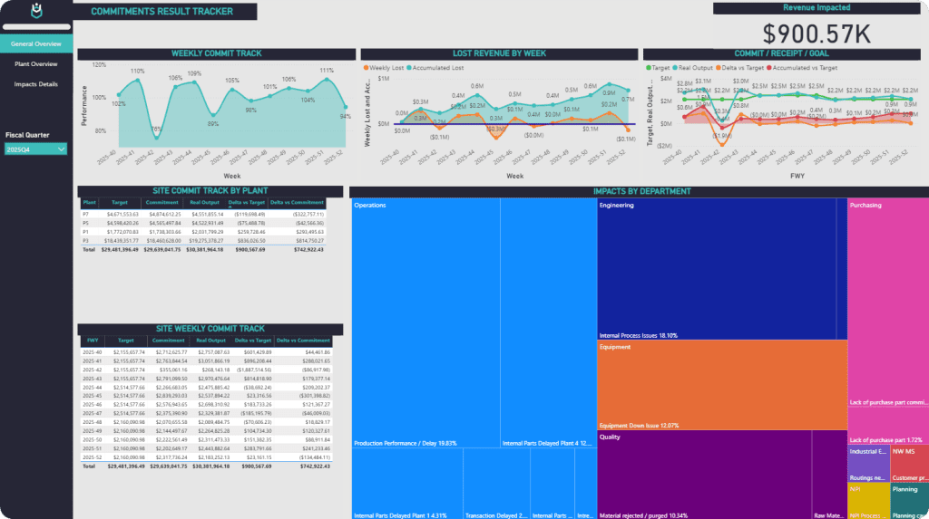
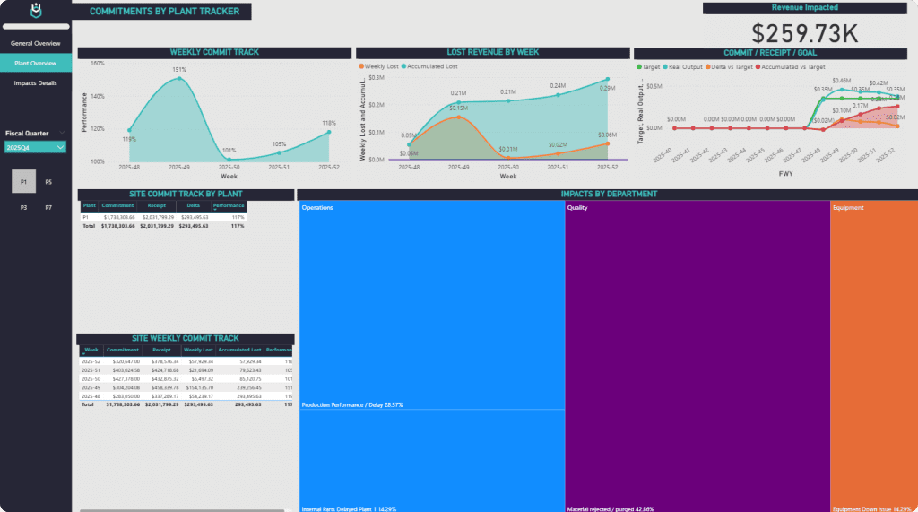
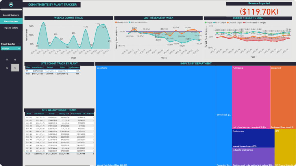
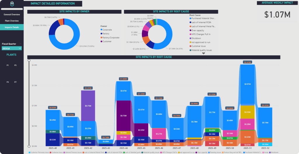
With the data prepped, I built a Power BI Dashboard for Manufacturing to visualize performance across the three levels. At the site level, I used line charts to track production trends against goals. At the plant level, bar charts highlighted output variations across facilities. For the customer level, I created heatmaps to show which clients were most impacted by shortfalls. In my case, I’ve learned that stakeholders love interactive visuals—nothing communicates a revenue impact faster than a dashboard they can explore themselves. Power BI’s drill-down features let users toggle between site, plant, and customer views seamlessly.
Identifying Key Metrics for Revenue Impact
During the exploratory data analysis (EDA), I focused on metrics like production volume, downtime hours, and revenue per unit produced, segmented by site, plant, and customer. For example, I found that one plant consistently underperformed due to equipment issues, affecting specific customer orders. This multi-level approach revealed patterns that a single-level analysis would have missed, like how plant-specific bottlenecks rippled through to customer satisfaction and revenue risks.
Analysis and Modeling: Digging into Root Causes
Analyzing Production Shortfalls Across Levels
To identify root causes, I used SQL queries to analyze downtime logs, supply chain delays, and labor metrics at each level. At the site level, I uncovered systemic issues like over-optimistic forecasting. At the plant level, equipment maintenance schedules were a recurring problem. At the customer level, I found that certain clients faced repeated delays due to misaligned commitments. In my experience, breaking down the analysis this way helps pinpoint where interventions are most needed, turning raw data into a story stakeholders can act on.
Linking Impacts to Revenue Risks
Connecting these shortfalls to manufacturing industry revenue impacts and risks was key. I calculated the financial impact of missed targets at each level, factoring in lost revenue and potential penalties for unfulfilled customer commitments. For instance, a single plant’s downtime led to a 15% revenue shortfall for a key client. Sharing these insights via the Revenue Impact Dashboard sparked productive discussions with corporate leadership, who appreciated the clarity of a customer-level revenue impact dashboard.
Conclusions and Recommendations: From Insights to Action
Proposing Action Plans for Stakeholders
The analysis led to tailored recommendations: optimize maintenance at underperforming plants, adjust site-wide forecasts, and align customer commitments with realistic production capacity. The Power BI Dashboard allowed stakeholders to explore these insights interactively, from site-wide trends to customer-specific impacts. In my case, I’ve found that giving stakeholders hands-on access to data builds trust and drives action. The dashboard became a tool for ongoing monitoring, helping teams track progress against action plans.
Communicating Findings with a Power BI Dashboard
The Power BI Dashboard was the star of the project. It unified site, plant, and customer data into a single, interactive platform, with features like scenario analysis (e.g., simulating a 10% reduction in plant downtime). Sharing it via OneDrive ensured accessibility for remote teams. The feedback was overwhelmingly positive: “This dashboard makes it easy to see where we need to focus, from the big picture to the customer level.”
Technologies and Tools: Power BI, SQL, Excel, and OneDrive
Why These Tools Were Chosen
I chose Power BI for its ability to handle multi-level manufacturing analysis and create dynamic dashboards. SQL was essential for querying large, complex datasets across site, plant, and customer levels. Excel supported quick calculations and manual data entry, while OneDrive facilitated seamless collaboration. Together, these tools created a robust workflow from data extraction to visualization.
Streamlining Collaboration with OneDrive
OneDrive was a lifesaver for sharing datasets, reports, and dashboard prototypes with distributed teams. In my experience, tools like OneDrive simplify version control and keep everyone aligned, especially when juggling feedback from site managers, plant supervisors, and account teams.
Conclusion and FAQs
This project showcased the power of multi-level manufacturing analysis to address manufacturing industry revenue impacts and risks. By building a Revenue Impact Dashboard, I provided stakeholders with clear, actionable insights across site, plant, and customer levels. The combination of Power BI, SQL, Excel, and OneDrive made this possible, proving that the right tools can transform complex data into strategic solutions.
FAQs
- How do you create a customer-level revenue impact dashboard? Define metrics like delivery shortfalls and revenue per client, integrate multi-source data, and use Power BI for interactive visualizations.
- What are common revenue risks in manufacturing? Equipment downtime, supply chain delays, and misaligned commitments, especially at the plant and customer levels.
- What are best practices for Power BI dashboards? Design for interactivity, ensure data accuracy, and segment data by relevant levels (e.g., site, plant, customer) for deeper insights.